
Adventures in Proofreading (part 3)
[A pretty page is like a melody.]

“The House Beautiful is, for me, the play lousy,” Dorothy Parker once commented,1 but what of the page pretty?
Well, the page pretty is, for me, the joy literary, so let’s see what we can do in the continuing service of books attractive.
You may recall, from the earlier installments of this ongoing saga, that, having read the text thoroughly and confirmed, among other things, running heads and page numbers, intrepid proofreaders are deep into the process of ensuring that the text they are working on is not only coherent but well-arranged and visually appealing.
An easy next thing to do, for a start, is to check for widows and orphans, by which we mean—or at least, in my Random House tenure, we meant; as with so much publishing terminology, some terms are used uniquely each to their own house—pages beginning with an ongoing paragraph’s concluding line that does not run fully all the way to the right-hand margin (that’s a widow)2 and paragraphs concluding with too few characters, let’s say less than four (though perhaps five is nicer) including terminal punctuation. Which is to say that a paragraph concluding, on its final line, “cat.” is fine and a paragraph concluding, on its final line, “to?” is not fine.3
Wouldn’t it be nicer to have a somewhat longer last line of a paragraph?, you may be inquiring,4 more like four or five words than four or five characters (including terminal punctuation)? Well, sure it would be nicer, but text is text, and you set it the way it comes, and arrange it as best you can, and to rewrite/augment text to extend a line for the sake of filling out a line would be utter madness, and we are not quite that utterly mad here.
Then, having dispatched the widows and orphans, you’re going to run your eye and, if you’re me, finger up and down either side of the text in search of instances of three consecutive lines beginning with the same word or concluding with the same word or the same punctuation mark. If you encounter one of those, you will excitedly (because they don’t come up all that often, so they’re a bit of a treat) write in the margin: Fix stack. Or: Fix ladder.5 Because that’s what we call those triplets: stacks or ladders.6
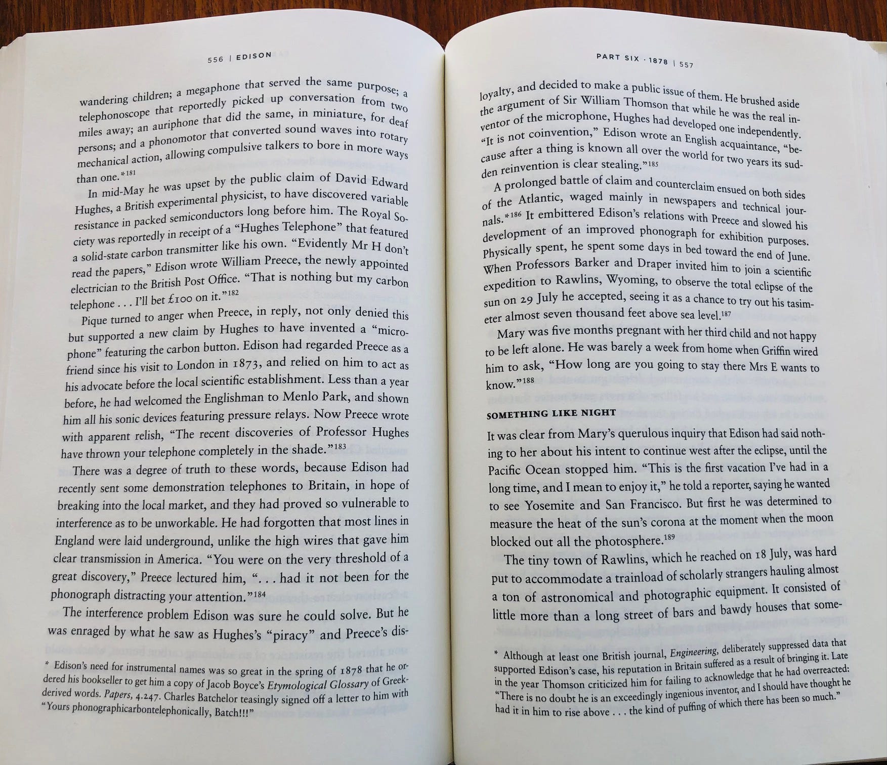
You’re also going to check for loose and tight lines, that is, lines of text with great big gaping spaces between the words or, on the flip side of that coin, almost no space at all.7 That very last text line on p. 557, above, of Edmund Morris’s Edison is maybe just verging on egregious looseness, but ultimately I think it’s OK.8
Also, speaking of that last text line on p. 557, above, of Edmund Morris’s Edison, it’s believed in some quarters that it’s sinful for a page (particularly a right-hand page) to conclude with what we call a soft hyphen—that is, a hyphen that, for page-making purposes, breaks a word that doesn’t naturally include a hyphen: The hyphen in dis-/loyal (at the bottom of p. 556/top of p. 557, above) is a soft hyphen; the hyphens in a word like “merry-go-round” are hard, or permanent, or fixed, or whatever you want to call them. If that’s indeed sinfulness, it’s sinfulness I can happily live with and have done for decades.9
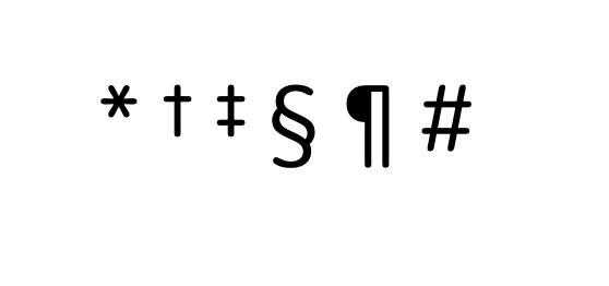
You will also note, on this spread from Edison, two footnotes, one per page, each called out with an asterisk, containing a bit of digressive text that doesn’t quite go in the text proper but that the author very much wants you to read in the moment. Had either page included a second footnote, it would have been called out with a little daggery-type symbol (also called an obelus, though not by me); a third would have been announced with a double dagger; then would follow, as necessary, a section sign, a paragraph symbol (a pilcrow!), and, anticlimactically, a number sign (which we used to call an octothorpe and now, I guess, almost universally call a hashtag).10
There are also, to be sure, a series of superscript numbers here, 181 though 189 on this particular spread, which are there to guide the reader to, largely, citational information (sources, that is: books, newspapers, journals, etc.) that can be found in the back of the book, where it belongs.11 I have, in my day, seen books, invariably or almost invariably published by academic presses, that set citational information at the bottom of each and every page, and ye gods you’ve never seen anything more unattractive or reader-unfriendly.
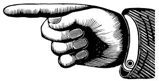
On that finger-pointing note,12 let’s pause here.
Next time up (the ultimate leg of this odyssey? good gosh, I hope so, but one never knows13), we’ll talk about bad breaks—a big topic!—and whatever else I can think of that hasn’t been covered yet.
To be, as ever, continued.
Yours,
Scheherazade
The Fine Print
Thank you, as always, to subscribers to this series, and thank you, particularly, to paying subscribers. I want everyone who wants to read this material to be able to read it whether they can comfortably pay for it or not; those of you who do support this endeavor financially are not only making it possible for me to do my work but helping make it available to other readers.14
Mrs. Parker is always, down through the ages, saying and writing a lot of things she never said or wrote, but this one, as best I can confirm without having a copy of the March 21, 1931, issue of The New Yorker in front of me, is authentic. As, happily, is “Tonstant Weader fwowed up.”
An ongoing paragraph’s final line, I underscore (or, actually, set in italics, lest you think I’m linking you to another article). A paragraph of a single line can happily and correctly sit at the top of a page.
The proofreader notes WIDOW or ORPHAN so that the error will be repaired in the next set of pages, circling the note. (See footnote 5, below.)
Or “enquiring,” if that’s the sort of person you are.
You will also circle those Fix stack or Fix ladder comments, because that signals to the compositor who will be making changes/corrections in the text that you are indeed making a comment and not calling for the phrases Fix stack or Fix ladder to be actually inserted into the text.
Do I believe, in my heart of hearts, that readers would be offended by—or even consciously aware of—retained stacks/ladders? Consciously, maybe not. But I do think that lax page-making has a cumulatively displeasing effect on the eye and brain, whether or not the reader is immediately aware of it.
Even as we speak, I’m reading a book whose typesetting isn’t perhaps all that it should be, and some of the lines are set so tight that there’s virtually no space between the words at all. I’d show you a screenshot, but I know some of the parties involved and it would be, I think, unkind of me to show you something you might easily google back to its source. So you’ll just have to take my word on it.
I first worked with Edmund, hand very much in hand, on Dutch, his notorious (and, I think, brilliant, in its somewhat lunatic fashion) biography of Ronald Reagan, and continued to work with him, in varying degrees of intimacy, on, among other titles, our republication of his Pulitzer Prize–winning (en dash alert!) The Rise of Theodore Roosevelt and also, freshly, Theodore Rex and Colonel Roosevelt. His Merrily We Roll Along–style Edison (yes! it runs backward! also: another en dash alert!) was his final work, and he died, quite suddenly, just as he’d completed work on the page proofs, which was an extremely Edmund thing of him to do. He was a lovely fellow, goodhearted, hugely funny, always open to suggestion and tactful criticism, breathtakingly meticulous, and he called me, always, “Beniamino.” I miss him very much.
Two further things to bear in mind on this particular subject are that (a) We do not live in the era of hand-set type, where things can be endlessly, bespokely, artisanally puttered around with, and (b) as you well know when you pull on a sweater’s stray thread, one little action can lead to multiple unexpected and/or unwanted results: The willful extermination of a soft hyphen, for instance, may leave behind one of those egregiously loose lines we’re trying to avoid, plus it will certainly cause the remainder of a paragraph to reconfigure itself, perhaps doing further visual damage.
The text of that book that I wrote that perhaps you’ve read positively floats on a gentle, sun-dappled sea of footnotes, but even I never got past three footnotes on a page, though there is, as I recall, one footnote that itself kicks off two footnotes, which I can assure you did not endear me to the folk who were in charge of creating the eventual ebook.
I say “largely” because some authors—and this was a habit of Edmund’s—may also toss the occasional amusing anecdote that’s too good to waste but can’t be justified even as an on-page footnote (I always thought of them as Easter eggs) into the backmatter notes, perhaps as a reward for readers who’ve gone to the trouble to look back there at all.
Also, those superscript numbers should resume, chapter by chapter (or, in Edison’s case, part by part), at 1, otherwise at some point you’re going to be looking at pages freighted down with four-digit superscript numbers. (Even three is a lot, to be honest, but, again: The book is the book, and the apparatus serves the text, not vicey versey.)
A writer can also take the option of using catchphrase notes, also called blind notes, in which each note is called out in the back of the book with a phrase of three, four, or maybe five words from the main text introducing the relevant citational information. This leaves the pages of the book unlittered with superscript numbers and thus perhaps a bit less academic-looking/daunting. When I first started in publishing, superscript numbers were very much the fashion and catchphrase notes were the rare outliers. Now it’s very much the other way (by authorial choice, to be sure).
The finger-pointing symbol is called a manicule.
“Do one?” —Fats Waller
Sallie thanks you as well.
This is my jam.
After going over it twice, I think I agree with everything you say (and I am thrilled to learn the terms for stacks and ladders, because I love putting words to things)—though my own most recent adventures in book design I have taken endless pains to end every paragraph with at least two words on the last line and never to break a word at the end of a righthand page. That was going above and beyond, though, in a labor of love. And I’m a little bit obsessive-compulsive!
It really is worth remembering that the dagger is indeed called an obelus, because it calls to mind my favorite note in any dictionary ever. In the OED s.v. obelisk, "Post-classical Latin 'obeliscus' is used for 'obelus' to denote a type of diacritical mark by analogy with post-classical Latin 'asteriscus' asterisk n., **with which it generally occurs in juxtaposition**." Emphasis mine.
Before that moment, despite knowing that there was a pun in every character name in Asterix & Obelix, I had never gotten that delightfully obscure one. By Toutatis!