
Adventures in Proofreading (part 4)
[the final adventure!]

You may recall from the earlier discussion of running heads that they tend to travel in pairs, with the meaningfully larger entity to the left and the meaningfully smaller entity to the right (thus author name left/book title right, book title left/chapter title right, part title left/chapter title right, etc.).
I was racking my brains for an example of a worthy exception, and all this time it’s been sitting right on my desk.
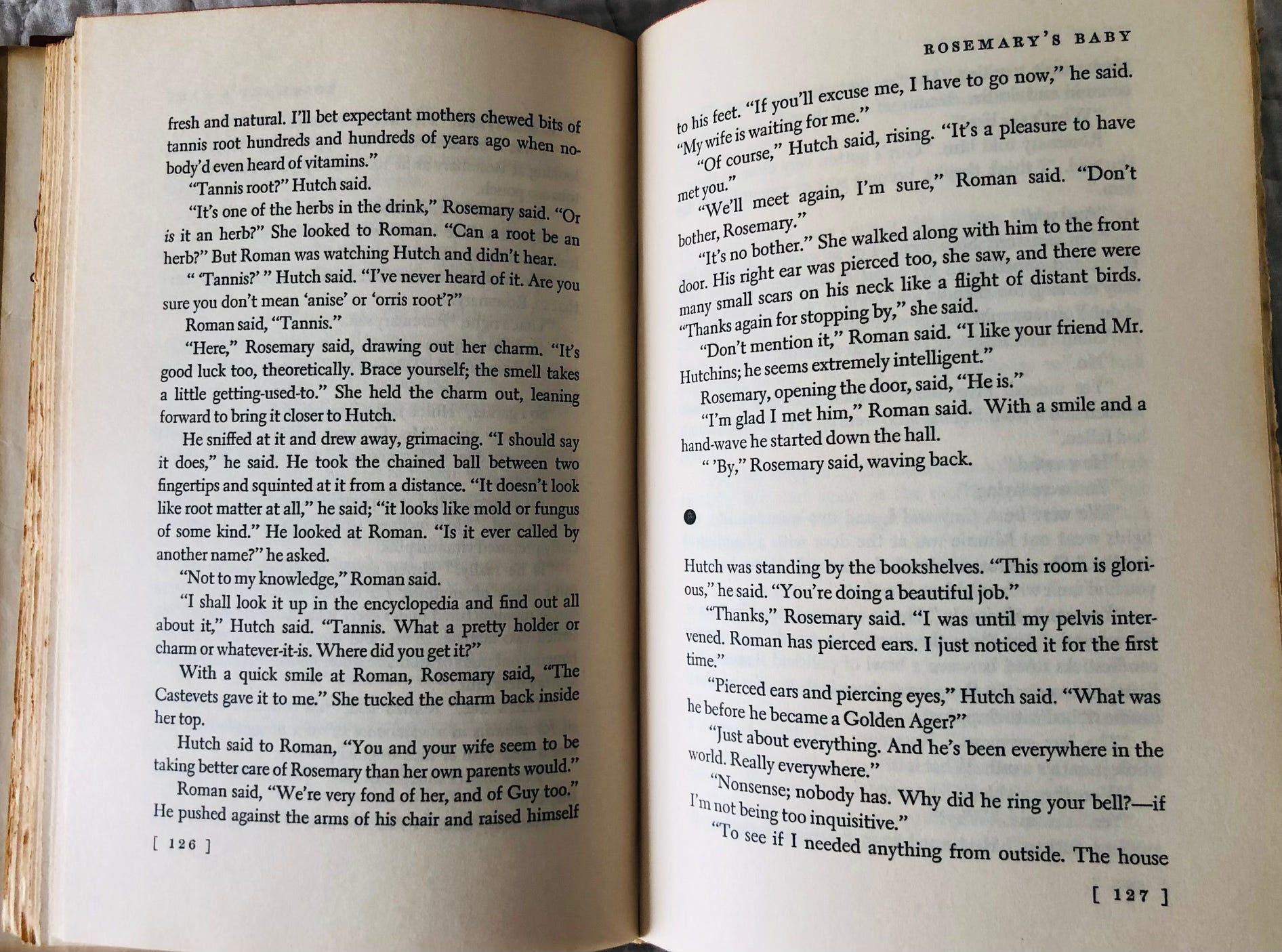
This is a spread, to be sure, from Ira Levin’s Rosemary’s Baby, and where you might expect to see, to the top left, the author’s name you see, also to be sure, nothing at all. It is at least possible that Levin, shown the proposed text design for this absolute corker of a novel, one of my favorites, declined the thrill of seeing his own name repeated some 120-odd times over the course of the book (beyond, that is, its appearance on the front jacket and in the flap copy and, in this instance, on the back jacket as well, accompanying a charming photograph of the author; on the spine of both the jacket and the case;1 on the frontmatter Also By This Author page;2 on the title page; on the copyright page; and on the backmatter About the Author page). To be sure, the right-hand repetition of the novel’s title might also have been eschewed (one is not apt to forget what book one is reading, is one), but the complete effect as it is is,3 I think, a pleasing picture frame, including the page numbers tidily bracketed at the page bottoms.
I can’t say, as long as we’re peering, that I’m entirely mad about the spacebreak ornament, that rather bulky, dull dot, but I suppose it’s better than, I dunno, a satanic pitchfork. Of course there needn’t have been an ornament at all; that’s another option.
Oh, that reminds me. You’ll note on this spread from Elizabeth Strout’s Olive, Again that one of the spacebreaks is marked with an ornament and one is not:
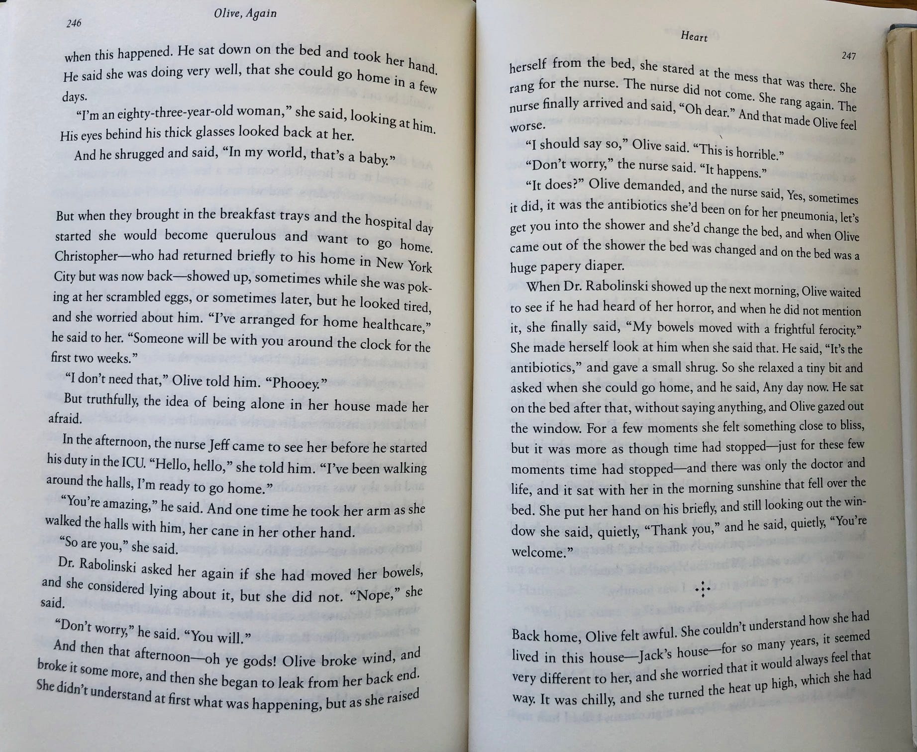
That’s because the author envisioned two levels of mid-chapter pauses in the novel, one slightly milder, a bit more momentary, one slightly firmer, a bit more multiply4 momentary. Thus the former is simply a bit of space and the latter is decoratively marked. Will the reader consciously notice this? Perhaps. Will the reader simply sense it? Also perhaps.
You’ll note as well, on this spread, that there are four lines of text after the spacebreak ornament on p. 247, which is, I’d say, visually pleasing.5 Good bookmaking requires at least two lines of text at the bottom of a page after a spacebreak (or two lines of text at the top of a page before a spacebreak), as good bookmaking also requires, or at least prefers, five lines of text on the final page of a chapter.6
Speaking of the final page of a chapter, you may well notice that, in some books, chapters begin only on right-hand pages, and, in some other books, chapters begin on either right- or left-hand pages.7 To some extent that’s simply an aesthetic decision on the part of the designer; more than occasionally it’s how the issue of a book’s page count has been addressed. If a book is running on the short side (one tends to dearly hope to crack 200 pages, which is sometimes a challenge in what might be called a novella8), commencing chapters only on right-hand pages will help stretch the page count; opening on rights or lefts will compress the page count.9
(Other means of addressing a book’s page count, as long as we’re here, include the determination of the size of the typeface, the generosity of interline spacing, how many lines of type you’re setting per page, the width of the margins, and of course the size of the book itself. For a standard hardcover reading book—by which I mean not an illustrated extravaganza—you’ll tend to see, roughly, either of two sizes, or trims, as they’re known: At Random House we went with 6-1/8 inches by 9-1/4 inches, which we called D trim, or 5-1/2 inches by 8-1/4 inches, known as C.10 Shorter books tend to lend themselves to the smaller trim, which will naturally extend their page counts; it also seems to suit what is often their relative inherent intimacy, or so one tells oneself as, again, one keeps a sharp eye on that page count.)
Which leaves, I think, only one last subject to be covered in these adventures of proofreading (at least until I realize, or am reminded, that I’ve forgotten something crucial and am forced to do a sequel episode): bad word breaks.
Lines of text don’t always want to run absolutely and fully and tidily to the right-hand margin, and sometimes words need to be broken between lines with what, you may recall, I referred to earlier as soft hyphens.
Now, the magical softwares that are tasked with getting words from a manuscript onto a typeset page tend to know, because of how beautifully they’ve been programmed, where a word can or cannot be broken at the end of a line, but proofreaders have been tasked since time immemorial with backstopping for those magical softwares.
The short version is: A word can be broken wherever the dictionary says it can be broken. Or nearly so. For instance, our friends at Merriam-Webster advise us that the word “sedimentary” can be broken at any one of four places, indicated, as perhaps you’ve noticed, by dots:
sed • i • men • ta • ry
Ah, but: Letting the final two letters of a word spill over onto a subsequent line is held to be unsightly, so let’s cut that down to three places:
sed- / imentary
sedi- / mentary
sedimen- / tary
Ah, but again: Some words don’t necessarily break where you think they do. For instance (and this is rather famous among proofreaders), the word “extraordinary” does not break between the “extra” and the “ordinary,” as you might suspect. It breaks after the ex, the traor, or the di. And for some arcane reason (this used to be the case, I’m reasonably certain it isn’t any longer), the word “England” was held by the dictionary to break not at Eng • land but at . . .
En • gland
Which, I assure you, drove authors of books about England quite, quite up Hadrian’s Wall. (As I recall, at some point we just collectively decided to reconfigure the acceptable break to Eng • land and everyone was much happier.)
Some words—and this is fun and tricky, one of my favorite combinations—maintain different syllable breaks depending on their use. For instance, “present” breaks as pre • sent as a verb and pres • ent as a noun, “project” breaks as pro • ject as a verb and proj • ect as a noun, and . . .
. . . there are others. That’s why you not only look things up in the dictionary but look them up carefully.
What else?
Well, at RH we never let the word “toward” break at all, no matter that some dictionaries classify it as a two-syllable word; it’s just, at RH, one indivisible clump of letters.
And contractions like “wouldn’t,” “didn’t,” “shouldn’t,” etc., aren’t allowed to break between lines, because a “would-” at the end of a line and a “n’t” at the beginning of the next would, again, be displeasing to the eye.
You also don’t want to end a line with a word, an em dash, and a single-letter word, as in, for instance:
. . . we found ourselves in Macao—I
. . . a short trip across the border—a
(The proofreader simply instructs the compositor to push the single-letter word down to the next line on the next, corrected set of pages.)
And you certainly don’t want to conclude a line with a word, an em dash, and then a fraction of the next word, as in:
. . . we found ourselves in Macao—sub-
[with, that is, the likes of “sequently” commencing the next line]
Or end a line with a portion of a word and then start the next line with the rest of the word and an em dash following, as in:
straint—a fine state of affairs.
[the previous line ending with re-, to be sure]
You’d also probably not want to break Henry I of the aforementioned England onto two lines, with the “Henry” at the end of one line and the “I” at the beginning of the next, or even Henry II or maybe even Henry III (though you might have to cope with Henry / VIII, which wouldn’t look quite so bad).
Similarly, H. L. / Mencken will do (though of course H. / L. Mencken will not do).
And no one’s ever enthusiastic to see a proper noun broken after its first two letters, so when proofreaders run into, for instance, Ho- / boken, they may attempt to push that Ho-, as it were, down to the next line, keeping the Pride of New Jersey intact.11
And on and on.12
All of this, to be sure, in the service of a well-made page and a happy reader, of which I hope you are, always, one of the latter.
Speaking of happy readers, this is, if my counting is correct, the seventy-seventh installment of A Word About . . . since I began this series back in March. If you’re relatively newly arrived, I hope you’re occasionally passing the time by working your way back through the Collected Works. I’m grateful to all my subscribers, paying or otherwise, but to those of you who have chosen to support this endeavor financially, I’m especially grateful.13 You’re not only making it possible for me to do this work; you’re also helping make it available to others. And that’s quite generous of you. (Paying subscriber or not, you’ll never face a paywall here.)
By the bye, one of you very kindly shared with me the other day a great quote, so I’m happy to pass it on.
“The world is a hellish place, and bad writing is destroying the quality of our suffering. It cheapens and degrades the human experience, when it should inspire and elevate.” —Tom Waits
Till next time,
Benjamin
One wishes to see an author’s full name on the spine of a book. Surname-only spines creep me out.
Popularly known as the ad card.
Could I have reconfigured that sentence so as to avoid that “is is” pairing? Sure I could have.
It’s not every day you run into an adverbial “multiply,” is it.
I nearly wrote “visually pleasing to the eye.” That would have been bad.
If a book is made up of myriad short chapters, it may not always be possible to get a chapter to wrap itself up with five lines of text, in which case you might have to settle for three or four lines. It’ll be OK. Two would look like hell, though.
Yes, that could have been “right-hand or left-hand pages.” But then I wouldn’t have been able to show you that bracingly crisp “right- or left-hand pages” construction and you wouldn’t have learned how to do it.
Though most publishers, I suspect, would rather impale themselves repeatedly and progressively on a picket fence than refer to, much less attempt to market, a book as a novella.
I recall participating in a negotiation to persuade an author that opening every one of her hundreds of chapters on a right-hand page was going to stretch her book’s page count, which was already sailing high into the 800s, into the mid-900s, making a guaranteed doorstop that much doorstoppier. Ultimately sanity prevailed; it doesn’t always. And not to get too far into the weeds, though I fear it’s far too late by now, but faced with a book whose page count is indeed in the 800s, 900s, or, gulp, beyond, one (by “one” I mean my accomplished and resourceful former colleagues in production whose responsibility it was to actually get our books manufactured) is also certainly looking carefully at the paper on which a book is to be printed. Some paper stocks bulk a bit more, some bulk a bit less (and are, hopefully, not transparent). Over the course of a mighty 900-odd pages (or over the course of a relatively fleeting 200-odd pages), the choice of paper stock can make a subtle but scarcely invisible difference in how a book looks on a bookstore shelf and feels in a reader’s hands.
And what of A and B?, you may be wondering. Once upon a time I knew what those trims were, or at least I had them noted on some piece of paper. Whatever they were we didn’t use them, so I let them slide out of my brain. (One of our larger trims, popular for illustrated books, was called “Yankee trim.” For years I envisioned some venerable New England printing press, run by someone called Eben or Dorothea, that specialized in books measuring 7-3/8 inches by 9-1/4 inches. Turns out that Yankee trim was called Yankee trim at Random House because the first time it had been memorably used was for a book about the New York Yankees.)
To be sure, the other Pride of New Jersey, Ho-Ho-Kus, owns its hyphens, so you might rightly break it at Ho-/Ho-Kus or Ho-Ho-/Kus (but you’d desperately try not to).
By which I mean: This is all that I can, for the moment, recall. If you can think of something key I’ve forgotten, of course give it a shoutout in the comments.
Sallie is grateful too. Or at least she will be when she wakes up.
This is so very interesting. To look at a spread as if it were an artistic composition, to consider the options, to reflect on the reader’s reaction to what appears outside the text and how that is presented…. I think constant readers feel all these things at a very intuitive level, but they have not isolated what goes into their reactions to the page. Very happy you have amplified this and hope you will continue to do so.
“By which I mean: This is all that I can, for the moment, recall. If you can think of something key I’ve forgotten, of course give it a shoutout in the comments.”
You covered word breaks at line endings with elegance and thoroughness, in what may be my favourite section of the piece. You alluded to numbers with the Henrys, but there’s as much to consider as with syllable breaks. I’d add keeping together numbers and units of measure,* mathematical operators in formulas, address numbers with street names, numbered streets with thoroughfare type &c.
Whether in Word or InDesign, I save the proofreader much trouble by chaining those terms with nonbreaking spaces so they remain together. Designers may object to deliberate breaking (always done with proper invisible characters, never forced with soft returns), because it affects word spacing and type fitting. That has not dissuaded me.
* Proper breaking with units and numbers and in mathematical formulas has played a big part in my work for clients in medical-pharmaceutical and mining.