


Tell all the truth but tell it slant—
[—or not]

[originally published February 16, 2025]
Today’s Q:
Is there a technical term for when italics are reversed? For example, if a whole sentence is italicized (because it’s a thought or something), but then a term within that sentence that would normally be in italics . . . isn’t? If that makes sense?
Today’s A:
Yes, that makes perfect sense!
There isn’t, that I’m aware of, a technical term for this, but I’ve long referred to it as “the flipback,” and I find it singularly hideous.
Let’s demonstrate.
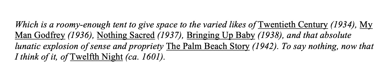
Here’s a passage of text as it would normally appear in print as what is often known as a block quote, or block text, but which at Random House we always referred to as an extract—that is to say, a lengthy bit of quoted matter that you want to isolate from your own text rather than encasing it—midthought, -sentence, -paragraph—in quotation marks, and which is set fully indented at least on its left side, and quite possibly on its right side as well (though I don’t have that capability here) and with a bit of space above and below:
Which is a roomy-enough tent to give space to the varied likes of Twentieth Century (1934), My Man Godfrey (1936), Nothing Sacred (1937), Bringing Up Baby (1938), and that absolute lunatic explosion of sense and propriety The Palm Beach Story (1942). To say nothing, now that I think of it, of Twelfth Night (ca. 1601).1
But let’s say that the text designer, for reasons best understood by the text designer themself, decides that all the extracts in a book are to be set, overall and generally, in italics. Then what happens?
Well, this is what happens:
Which is a roomy-enough tent to give space to the varied likes of Twentieth Century (1934), My Man Godfrey (1936), Nothing Sacred (1937), Bringing Up Baby (1938), and that absolute lunatic explosion of sense and propriety The Palm Beach Story (1942). To say nothing, now that I think of it, of Twelfth Night (ca. 1601).
Yikes.
One problem (and it’s not quite as obvious here as I’ve seen it in other typefaces, but still) is that italics are (or, at least, seem to my relatively layperson’s eye to be, and I’ll be happy to hear true facts and true figures in the comments from the professional-type type folk, of whom there are at least a few known to me in the neighborhood) slightly smaller than their sibling roman type, which effect is OK in text that’s largely roman with bits of italic but always looks (again, to me) off the other way around. (I recall, back in my day, sometimes asking text designers to cheat such text a bit by blowing up, ever so slightly, the italics.)2
When I started in publishing in the early ’90s, one fairly often ran into block/extract text set in italics. It was, simply, the fashion then (and entirely up to the text designer, presuming that the editor and the author subsequently signed off on it). At a certain point, the fashion shifted, and now one rarely encounters that style (and I certainly don’t miss it), and block/extract text is usually set identical to the book’s overall roman text—with that, as mentioned, helpful indentation and a bit of space above and below.
Before I forget, my querier specifically, you may have taken note, queried after “a thought or something,” and I would add that—thinking back, again, to when I first leapt onto the publishing train—over time the editorial fashion (because truly this is a matter of authorial/copyeditorial style rather than design preference) has shifted from setting thoughts in roman and quotation marks, as simply another flavor of speech:
Lucretia bolted the door behind her. “I’ll never agree to this sham of a marriage,” she mused (silently, of course, as she was not in the habit of speaking to herself aloud, at least not yet). “Never!”
to setting them in italics (sans quotation marks):
Lucretia bolted the door behind her. I’ll never agree to this sham of a marriage, she mused (silently, of course, as she was not in the habit of speaking to herself aloud, at least not yet). Never!
to, as one mostly sees now, simply setting them in roman (sans quotation marks):
Lucretia bolted the door behind her. I’ll never agree to this sham of a marriage, she mused (yes, silently, of course, we get it already). Never!
Which I think communicates eloquently and looks attractive, a fine combination. (Does it put a little extra pressure on the writer to differentiate clearly—or at least as clearly as is desired—between narration and thought? Sure. Good writers can cope with a little extra pressure. They’re sturdy that way.)
Generally: Extended passages set in italics, even if they manage to avoid any flipbacking whatsoever, are wearying to the eye, and if you’re in charge of designing your own text (or approving what a designer has proposed to you), I’d urge you to avoid lengthily aslant text. As I’ve occasionally noted, readers are apt to take one look at a multipage passage set in italics and infer (often accurately) that it’s a dream sequence or an extended bit of stream-of-consciousness monologuing and skip it entirely. And you don’t want to encourage readers to skip, entirely, multipage passages of your gorgeous writing, do you?
Of course you don’t.
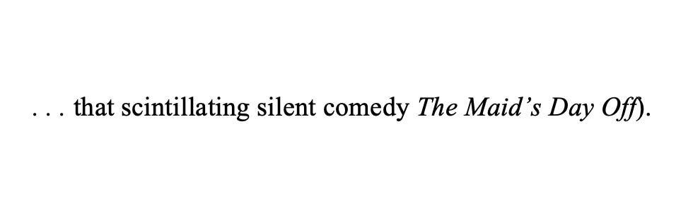
And what, by the bye, of the possible solution of using underscoring for what would normally be italicized text in a passage already set in italics?
I can’t seem to find underscoring here at Substack, so for your viewing (dis)pleasure:
Double yikes.
A, it’s hideous. B, it’s hideous. And, C, the whole thing fails aesthetically—and does so miserably, I’d say—the first time a descender goes crashing downward through the underscore.
You may also have noted in that text sample just above an occasional problem of the interaction between roman and italic type (look to the fourth line): the crash, or near crash, of an italic letter (f’s seem always to be troublemakers) and a following roman letter. It’s even worse, to be sure, when an italic letter abuts a roman closing parenthesis:
(The attentive proofreader will simply note in the margin: Comp3: Fix crash. And the comp will duly: fix crash.)
OK, that’s enough type talk for what was supposed to be a lazy Sunday when the weather is clement, as it is right here, right now.
As always, questions and commentary are welcome. More than welcome.
B.
Department of Taking Care of Taking Care of Business
Thank you all for being here, and thank you, especially, to subscribers, and especially especially to paying subscribers. I quote my friend Connie Schultz: “You don’t have to pay to read my writing. I understand that not everyone can do so, and I am grateful to those of you who do because you make it possible for me to keep writing.”
Sallie is grateful too.

Today’s cover illustration: Edward Lear, “L. goes out, but finds the wind inconveniently high,” from “A Walk on a Windy Day” (1860)
Text borrowed from, well, me: “Irene Goes Wild,” first published at Criterion.com on December 12, 2022. (As one of my readers has already noted, hyperlinks at Substack, as here, appear as underscores. Which is too bad, really. I’d be happier if they were just bright cerise and flashed at you, or some such.)
Isolated things can always be manipulated in isolation. I recall one book set in a perfectly lovely typeface (whose name eludes me now)—except for its capital Q’s, which were great scooping, swooping things that looked like invasive 2’s (remember those from being taught cursive in the third grade?) and whose lower curlicues ran fully under the invariable u’s to their right and perhaps, as I recall, under the letter even beyond that. And this was in a book with, for some reason, lots and lots of capital Q’s. Anyway, I found the overall effect a bit too, I dunno, pailletted Versailles masquerade ball and begged the designer to appropriate some other capital Q from some other typeface, and the designer was happy enough (or at least pretended to be happy enough) to accommodate me.
Short for compositor, that is.
And for you ‘Fontologists’ out there- ‘Helvetica’ the movie is an interesting watch.
Was it the ‘Domino theory’ or the viral spread of the font Helvetic that led to the Vietnam war?
Hunh. I must needs rethink all those italicized diary entries and handwritten letters.