
"overtones of hydrophobia"
[a caprice, with illustrations]

For the last few days, my morning coffee companion has been Since Ibsen, a satiric little volume from 1933 by George Jean Nathan, one of the preeminent theater critics of the middish twentieth century.
A few Nathan facts, for a start:
He is one of three writers I seem always to be reading. The other two are Peg Bracken and Shirley Jackson.
He was the model for All About Eve’s acidulous Addison (“You have a point. An idiotic one, but a point.”1) DeWitt.


He was pals with H. L. Mencken.
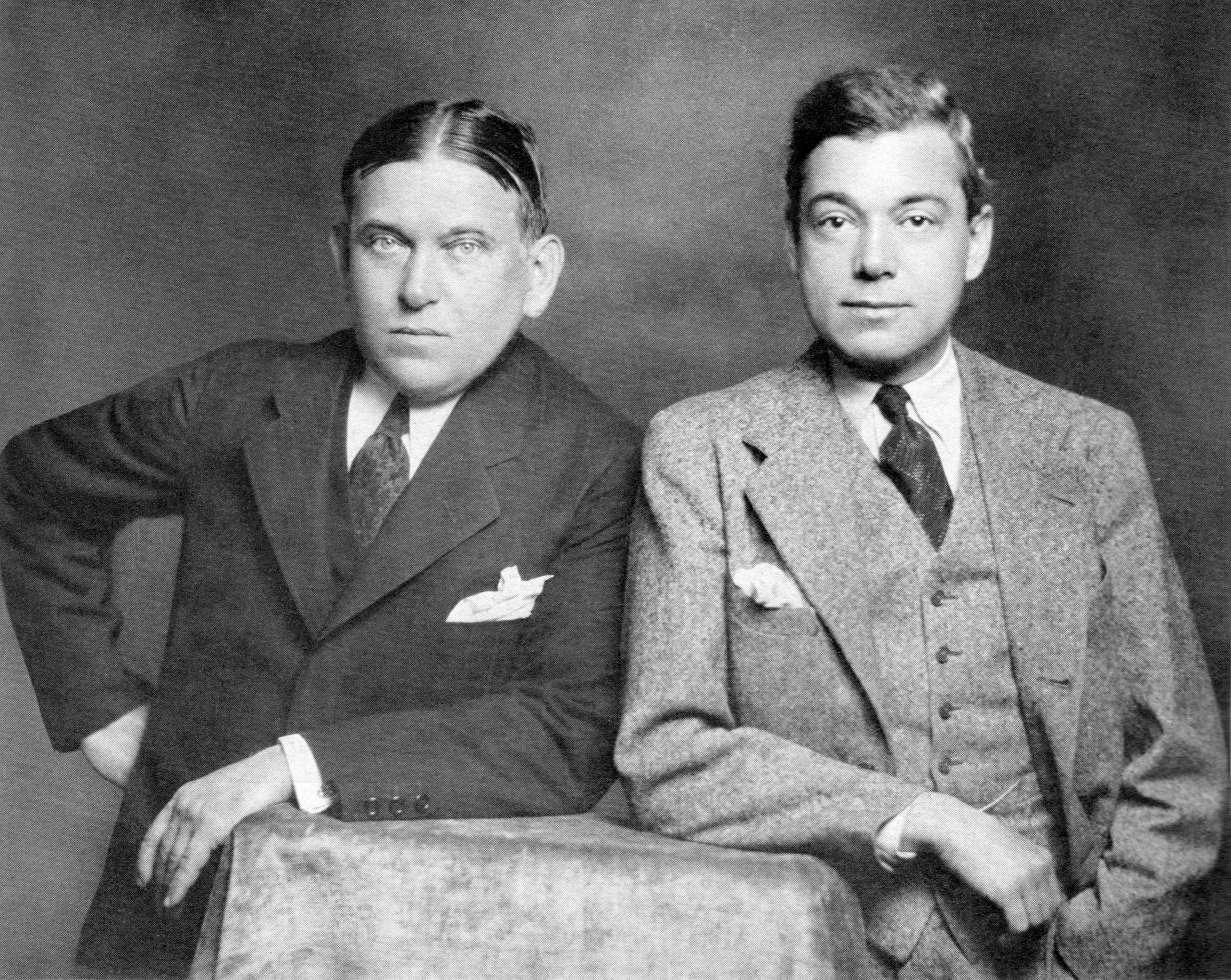
He enjoyed a decade-long romance with Lillian Gish, who may have enjoyed it as well but persistently refused to marry him, and ultimately he wed, three years before his death in 1958, the actress Julie Haydon, twenty-eight years his junior, whose name might strike a chord with you for her having originated the role of Laura in The Glass Menagerie.


Nathan was an intimate friend of Eugene O’Neill’s (it’s arresting to read Nathan gingerly alluding in the late 1940s to Long Day’s Journey into Night, which he’d read aeons before it was eventually sprung from its locked drawer at the insistence of O’Neill’s widow, Carlotta Monterey, and to the horror of O’Neill’s publisher, Bennett Cerf, and produced in 1956, three years after O’Neill’s death2); despised Eva Le Gallienne and Tennessee Williams;3 witheringly condemned Olivia de Havilland’s Juliet as one of the worst things he’d ever seen on a stage; idolized the comedian Bobby Clark;4 was persistently dubious about the increasing hegemony of the so-called integrated musical (integrated not in the racial sense but in the sense of possessing a book and a score that cohere intelligibly and in which the songs serve to advance the plot and characterize the characters: which is to say Oklahoma! and Carousel rather than Babes in Toyland and Piff! Paff!! Pouf!!!); always preferred a tried-and-true girlie show to anything featuring Agnes de Mille ballet dancers with legs, if I correctly recall GJN’s phrasing, like bowling pins; and never passed up an opportunity to call out Kurt Weill as a borrower of other people’s music, particularly something called “Souvenir” by one František Drdla.5
He was certainly, as my late mother might have said, a piece of work.
Anyway, back to Since Ibsen, which is Nathan’s fanciful collection of modern-day theatrical clichés—clownishly exaggerated but, one passionately hopes, each and every one based on something he’d actually endured.
Here are a few spreads:
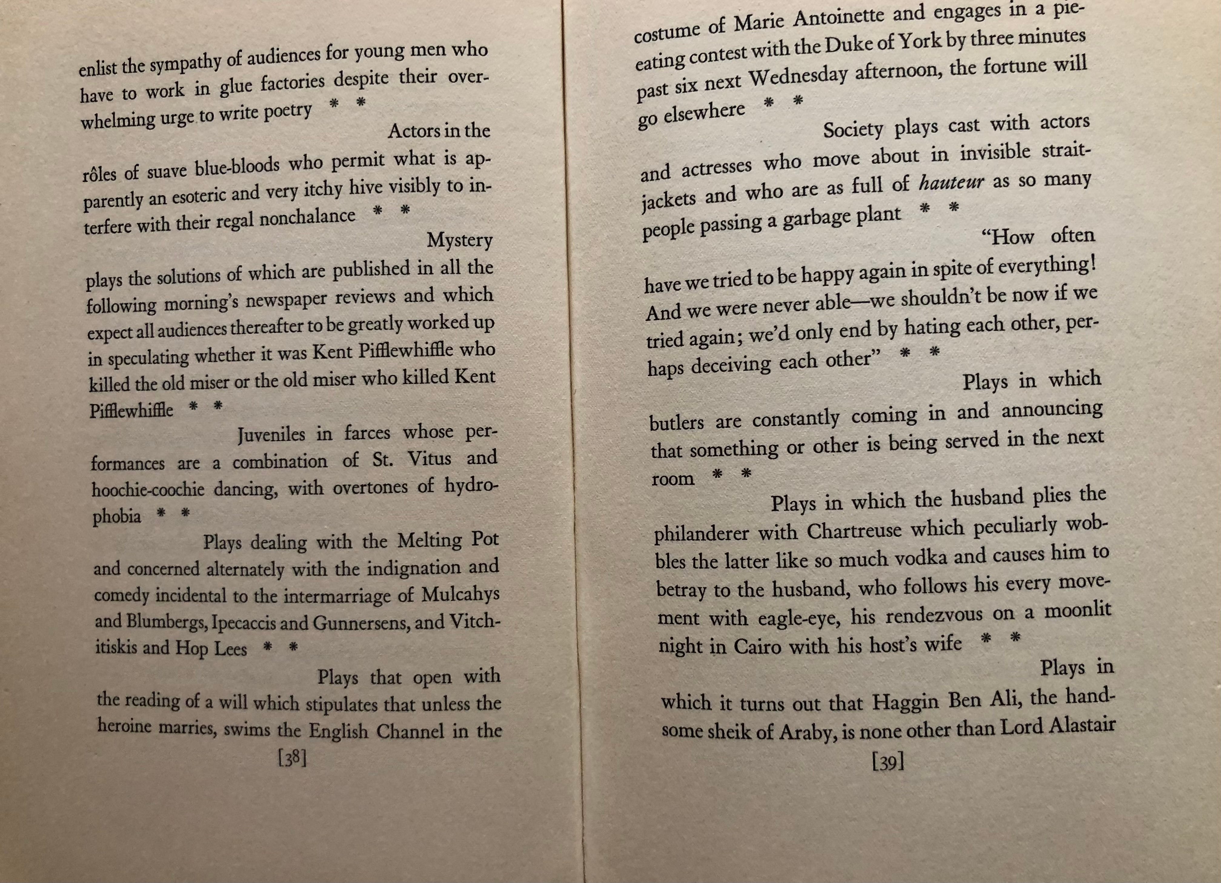
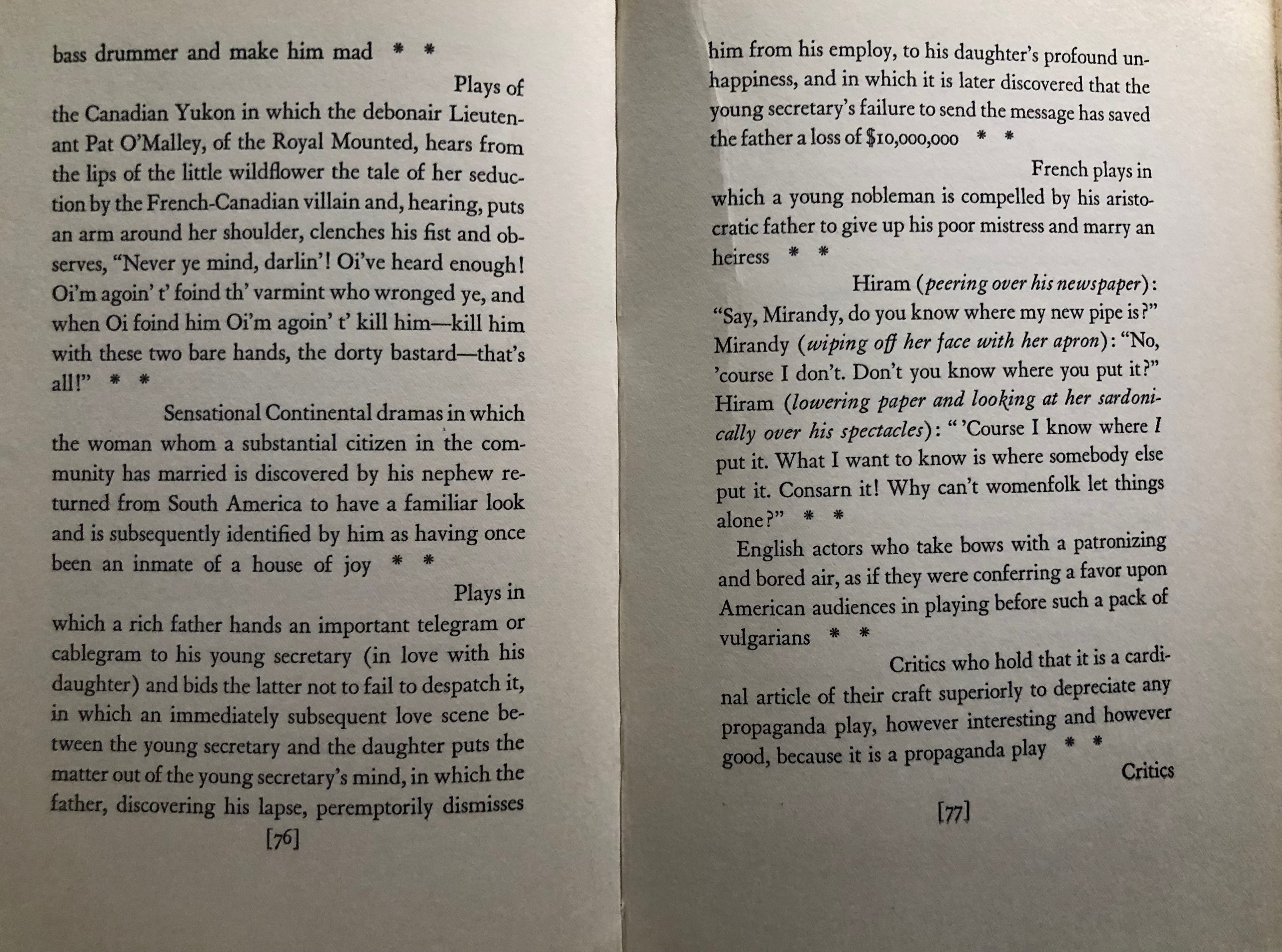
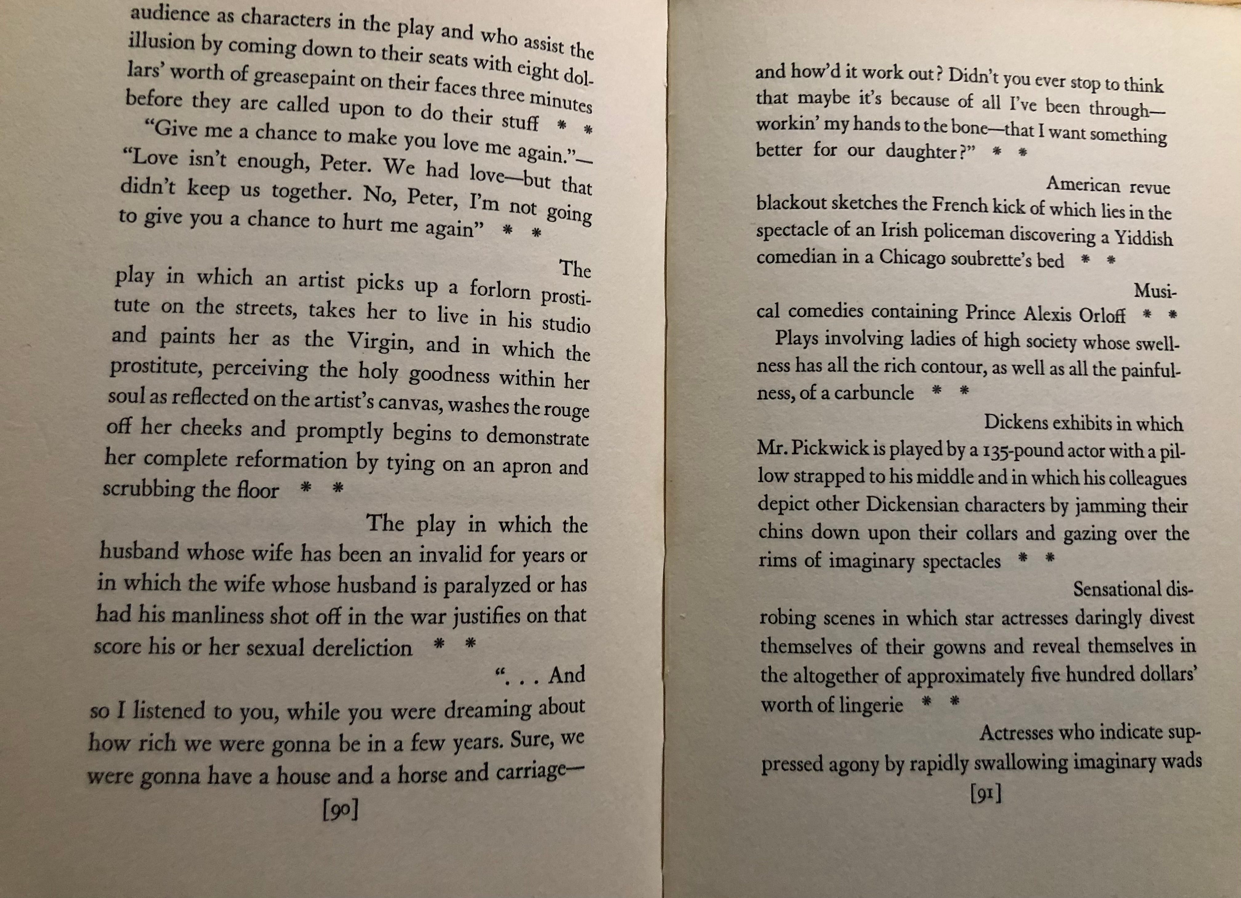
First, I trust you took note, up there on p. 38, of Nathan’s use of the piquantly old-fashioned “rôles,” the sight of which is, for me, like a joyful stay-at-home time-traveling jaunt. (See as well books including ’phones, ’buses, and people succumbing to the ’flu, which sometimes they do to-day and sometimes they do to-morrow.)
Second—and this was the simple inspiration for my desire to share these pages with you in the first place—I’m captivated by the work of the text designer, who, as you can see, has chosen to begin each new entry just to the right of and below the end of the previous entry, with two rather thudding asterisks serving as interstitial decoration.6
It is, as they say, a choice, though it’s a choice that has led to eyesores like that short first line on p. 76—a widow, that is; I’d mandate at least a line and a quarter or so of text at the top of a page—and that sawed-off bit at the bottom of p. 77: not what we’d technically call an orphan, which is what happens when a paragraph concludes with a line of fewer than four characters including terminal punctuation, but, again, a line and a quarter or so of text here too would make for a vastly more attractive page. All of this might have been (and should have been) tidied up before the book was published, but perhaps the crew at Alfred A. Knopf ran out of time and patience. To say nothing of the fact that, with a design like this and myriad brief entries, every repair in one place is apt to cause a fresh leak, or a number of fresh leaks, to spring up elsewhere.
All that said, one is reminded of the era, not really all that long ago, in which the laying out of text was done painstakingly by hand, and allow me to offer posthumous blessings on the designer and typesetters who did their heroic best here.
(To be honest, I think that the whole thing would look perfectly lovely—better, even, and certainly less fussy—if each entry started flush left and if the entries were separated by a single decorative ornament, centered, or perhaps just a line or two of blank space.)
And now, having looked through those pages of Nathan’s once again to be doubly sure that he hadn’t casually dropped any cancellable slurs, I’m happy to send this caprice out into the world, for the usual hoped-for edification and amusement.
I hope that you enjoy the rest of your weekend.
Benjamin
Post-publication addendum: If you’re a subscriber you’re not seeing this note at all, because you received this essay in its original form in your email in-box (or however these things make their way from point A to point B), but for the rest of you, I’m reminding myself to say up-front next time: Profound apologies for any and all typos, which I’m in the habit of noticing (and subsequently repairing) right after I hit the send button. Just like everyone else does. Sigh.
Taking Care of Taking Care of Business
Thank you for being here, thank you for following, thank you especially for subscribing. All of this substackery of mine is free and will remain that way, which means that if you have chosen to contribute to its and my upkeep,7 in larger or smaller ways, you are doing something you don’t have to do, which makes your generosity that much more resonant, and I am profoundly grateful. If you’re not yet part of that contributing crew and there’s a part of you that’s thinking “Who would have thought that apostrophes, commas, and ancient show business anecdotes could be so much fun?” and you choose to join the crew, I will be eternally (or at least monthly or annually) in your debt.
It was either that or “You’re too short for that gesture. Besides, it went out with Mrs. Fiske.” Choices were made.
O’Neill wrote the play—as a private exorcism, one presumes—between 1939 and 1941, and not only did he want it never to be produced, but he didn’t even want it published at all till he’d been dead for twenty-five years. Mrs. O’Neill clearly had other ideas.


Nathan’s contempt for the ambitious, dedicated Le Gallienne, whose artistic and intellectual pretensions bored him silly and whose acting he purported to find icily arid, was profoundly malignant, but one also can’t overlook the major bug he had up his fundament about Williams, right from the success of The Glass Menagerie, which Nathan insisted would have been no great shakes at all without the revisions imposed on it by Eddie Dowling (who directed and played Tom) and star Laurette Taylor. That Le Gallienne was a lesbian and Williams a homosexual may have had something to do with Nathan’s virulence, but that’s mere spitballing on my part.
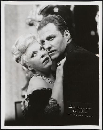
Here are photographs of Bobby, as Nathan invariably called him, in a 1947 revival of Victor Herbert’s Sweethearts and in 1948’s As the Girls Go, a musical about the first female president of the United States. (Bobby is the First Husband.) Note the painted-on eyeglasses.


Bobby also dabbled in the classics, and here he is, in a sketch by William-Auerbach Levy, in The Would-Be Gentleman, his own adaptation of Molière’s Le Bourgeois Gentilhomme, and with Mary Boland and Walter Hampden in Richard Brinsley Sheridan’s The Rivals.


Mostly, to be honest, I wanted to delve a bit into Bobby Clark so that I could recount to you the story of the day I was musing publicly at Twitter-as-was as to whether anyone even knew who Bobby Clark was anymore, and within minutes the divine Mitzi Gaynor popped by to say “Well, I certainly do!” and provided this as evidence:
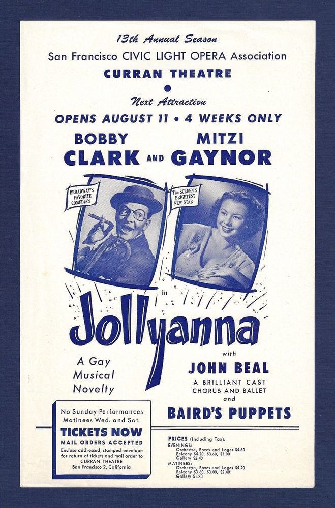
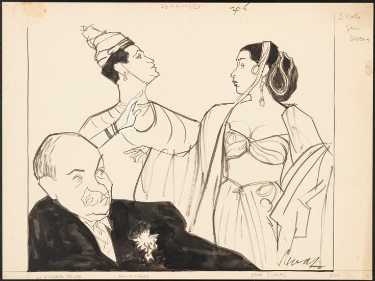
Jollyanna, for the record, was a 1952 West Coast attempt to salvage the 1951 Broadway catastrophe Flahooley, which had starred, among others, Barbara Cook, [Professor] Irwin Corey, and the Andean goddess Yma Sumac. Well, they tried. And failed. Further attempts to revise, revive, and rescue the show have continued well into the twenty-first century; perhaps one day they’ll get it right, produce it on Broadway with Daniel Radcliffe in the the Barbara Cook role—or rôle—and make a bloody fortune. It could happen.
I listened to this “Souvenir” item once, and it sounds nothing like anything Weill ever composed, at least not to my lay ears.
[Post-publication addendum: My musical chum the great John Baxindine more or less grabbed me by the ears to get me to hear that a six-note phrase in “Souvenir” matches the six notes in Kurt Weill’s “September Song” (lyrics by Maxwell Anderson) that accompany “these golden days I’ll spend [with you].” OK, now I get it. Hey, did you know that the three-note bride motif from Franz Waxman’s Bride of Frankenstein score is the same three-note phrase one repeatedly hears in Rodgers and Hammerstein’s South Pacific song “Bali Ha’i”?]
On the other hand, though, speaking of borrowing things, Nathan crucified Alan Jay Lerner for having gropingly appropriated Friedrich Gerstäcker’s 1860 short story “Germelshausen” for the libretto of the 1947 musical Brigadoon, and it’s scandalously funny to watch Nathan going at it. Gleefully and at length.
Anyway: If you’re even passably interested in twentieth-century American theater, I can’t commend to you too highly Nathan’s Theatre Book of the Year series (the volumes often show up in used book stores and are usually easy to find for not too much money online), in which from 1942 to 1951 he chronicled every single Broadway attraction (and quite a few productions from what we would now call Off-Broadway but which Nathan tended to characterize simply as the objects of tedious voyages to Greenwich Village), with lengthy digressions diving back through the decades of Nathan’s theatergoing. You’ll have to navigate around and through Nathan’s sexism, racial condescension, and various other prejudices, but that might well be outweighed by the fact that he’s an astute observer, a virtuoso writer, and fiendishly witty. Plus he always had something nice to say about Mae West (as who would not).
Except for that one spot about two thirds of the way down p. 77 where it doesn’t happen properly, who knows why.
And Sallie’s!

"I’m captivated by the work of the text designer, who, as you can see, has chosen to begin each new entry just to the right of the end of the previous entry, with two rather thudding asterisks for decoration." Thank you for noting this. I scanned the pages without reading the text and absorbed the layout without registering it. I had to go back and see what you were commenting on. The asterisks are thudding and the beginning and ending of pages was not considered, but this formatting encourages continuous reading—and makes it easy. Pages of snippets are not pleasant to read. No continuity. This layout encourages reading each snippet as part of the last. And solves the problem of the darker text-heavy left side and the white of the spacing on the right side. I love it when copy editors point out things like this. With a lifetime in the visual arts I have a very hard time with (1) the distractions of bad text layouts, (2) people who say it has to be that way—it's all done by machine now, and (3) it doesn't make any difference; no one notices. I'm in a discussion with a self-published author now about the horrible text layout of a very wonderful book. It won't be taken seriously by her audience.
Nathan’s THE ART OF THE NIGHT (1928) is one of the many books I have in my “to be read” pile. I think it may even be a first edition.